Services Delivered
- Website redesign
- WooCommerce setup
- Google Analytics setup
- Google Search Console submission
Delivering Peace of Mind
Fortis DPC are your experts in cyber security, PCI DSS, data protection compliance, GDPR and ISO compliance. Based in Downside, Surrey, they offer services to schools, churches, charities and businesses of all sizes.
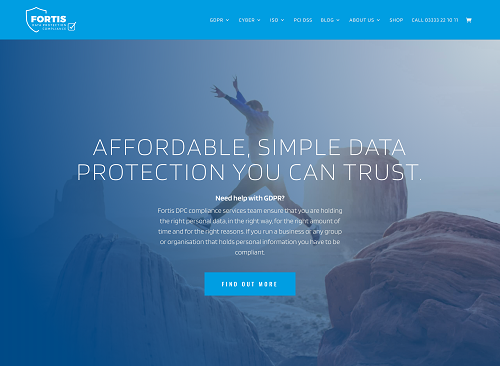
The client's biggest complaint with their previous website was the excessive use of blue, creating a cold and corporate feel which did not accurately reflect the company's values. They wanted the website to be "simple, navigable and to instil confidence." Finally, the new website's design needed to represent the company's name, Fortis, which is the Latin word for 'strong'.
A New Identity
With the above requirements in mind, we kept the two original shades of blue (#009ee2 and #004B88), but made the darker blue the primary colour. This, paired with the large, bold fonts (Oswald and Blinker), created a more impactful and sophisticated overall look and feel.
We then introduced the Venetian Red (#db190c) as the accent colour. Used in just the right proportions, it creates the perfect balance and also serves as a warning that we must be vigilant at all times. The result is a design which is bold, dynamic and upholds the company's values of strength, security and trust.
Subtle But Significant Differences
In line with the new design of the overall website, we applied the Venetian Red to the checkbox's outline in the company logo and parts of the icons to accentuate specific elements. Here, you can see the original and new logo, and examples of the icons we improved:
Accessibility Improvements
As part of our analysis of the original website, we found some elements of the design to be non-compliant with accessibility requirements, particularly the main paragraph text - the text was too small and the contrast ratio too low. This was remedied simply by increasing the size of the text to 16px and changing the text colour from light grey (#808080) to black.

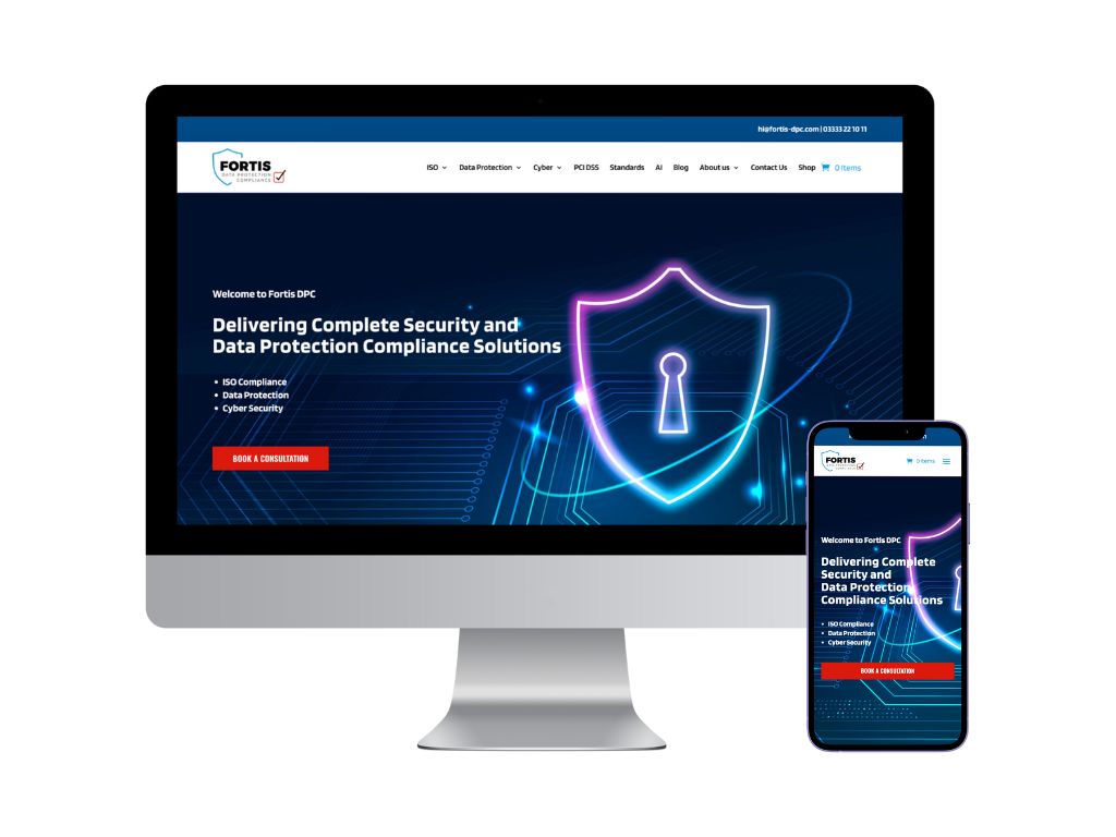
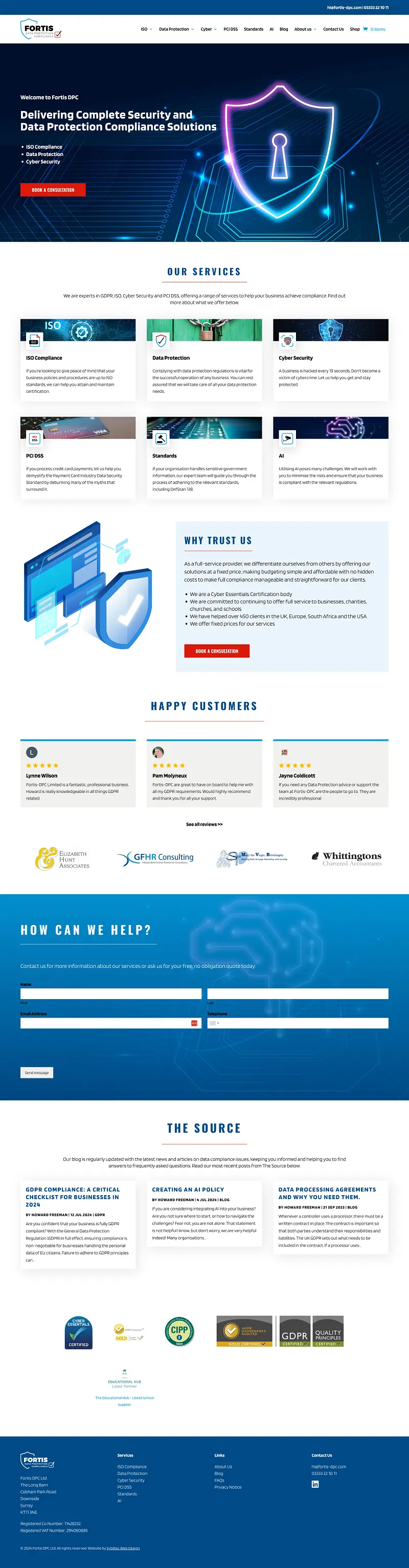
Homepage Redesign
We created an entirely new design for the homepage, reducing the amount of text and incorporating more imagery for a visually appealing experience.
We began with adding a bold image for the hero section to represent cyber security services. We rewrote the headline and subheadline, strategically including the relevant keywords.
The new homepage now showcases all six services offered, including Standards and AI. We moved the Services section higher up on the page for site visitors to find it with less scrolling required.
Building trust with prospective customers is of paramount importance, so we wanted to emphasise this by introducing a new "Why Trust Us?" section and adding reviews right on the homepage for maximum visibility.
Book a Consultation / Contact Me was made the main CTA (call-to-action) of the website, so to reflect this, we made the contact form stand out by placing it on a vibrant blue gradient background overlaid above a futuristic vector image.
Finally, the Source, Fortis DPC's blog section, was given a little improvement by reducing the amount of blur of the drop shadows, for a more subtle effect.
Before
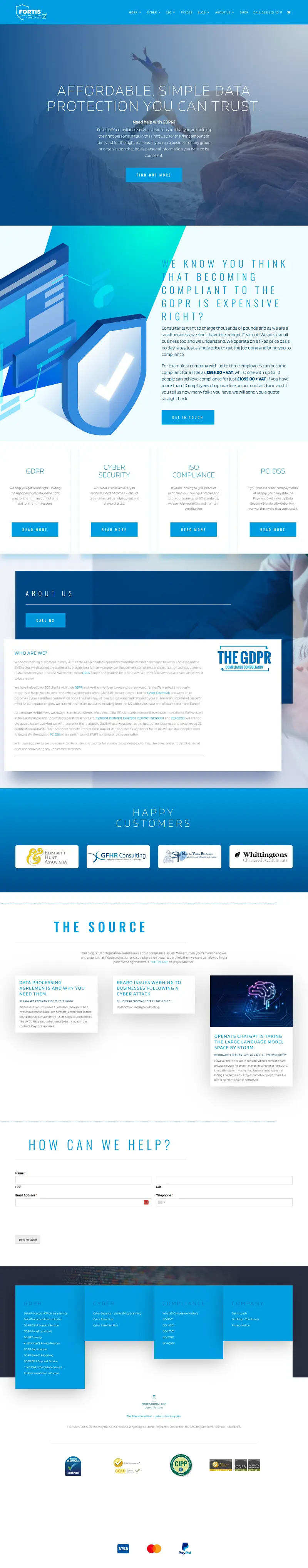
After
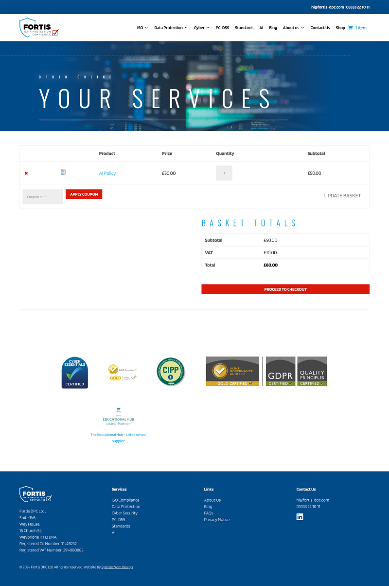
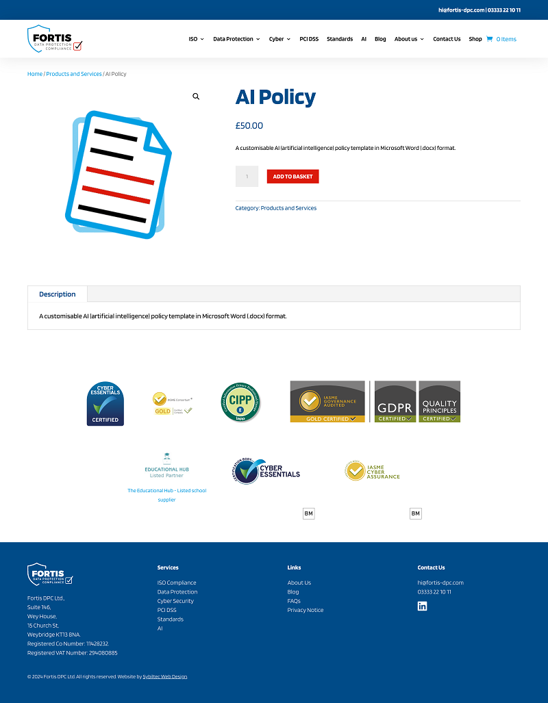
E-commerce Functionality
Fortis DPC wanted to sell products through the website and therefore needed e-commerce functionality. We installed and set up the WooCommerce plugin to enable this, with the Stripe Payments Plugin for accepting payments.
We styled the product page, basket page and checkout page accordingly to ensure that they were consistent with the rest of the website's design.
Customers can now purchase policies directly through the website, and there are plans to add more products in future.
Product Page
Basket